Top tips to get the most out of your investor relations website
Designing an IR website can be fraught with difficulty because of the need to appeal to different end-users, from the professional – journalist, analyst – to the retail investor. To get some insights into how to approach putting together an IR website, we spoke to Patrick Kiss, head of investor and public relations at shopping center retail firm Deutsche EuroShop (DES), and to Knut Wichering, who heads the Hamburg office of EQS Group, an international technology provider for digital IR with more than 300 professionals in Europe, Asia and North America.
Kiss is a proponent of what he calls the one-click approach to IR website design. From the point of view of a professional, DES’ site is a joy to use: hover the mouse over the IR link and 44 distinct links appear organized under nine groupings. It sounds overwhelming, but the ease of use is significant. ‘Form must follow function, not the other way around,’ explains Kiss.
He points out that the IR page on DES’ website is the biggest page with the most content, the most important element of which he says is ‘being able to get in touch with IR managers in the easiest way possible’.
Emphasizing the importance of the IR website, Kiss tells a story of some South African investors who decided to invest in the company largely based on the quality of its IR page – something that went a long way to convincing the CEO that the resources put into the site were more than worth it. ‘It is not the most modern-looking site,’ Kiss concedes, ‘but it is the most user-friendly.’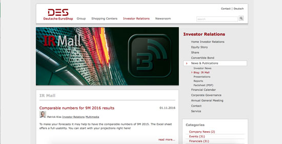
The Deutsche EuroShop IR website. Click for a larger image
Patrick Kiss’ IR website dos and don’ts
1. EU regulations mean many announcements and releases must be posted to the website within minutes – so it is important to be able to manage content internally.
2. Websites that require a lot of scrolling ‘make you feel as if something is being hidden,’ Kiss warns.
3. With a one-click site there is full disclosure of everything available on the site, organized into useful groups and headings.
4. Ensure you are not just complying with regulations but rather disclosing all the information that might be useful to a stockholder. ‘For example, we publish analyst reports whether they are recommending a downgrade to our stock or an upgrade,’ says Kiss. ‘If we just publish the upgrade reports, investors end up not trusting the site.’
5. Write your HTML so it is displayable on all devices, removing the necessity of designing a separate mobile application that might not be able to contain all the information.
6. Provide actual documents – not just links to documents – but try to avoid PDF-mania: make them available in HTML or an equivalent.
7. Once a presentation is posted on the site, do not remove it after six months. Instead, treat the page as an IR archive.
8. Average visitors are likely to be non-professionals so if they can’t find what they want straight away they will move onto another company whenever possible.
9. Make sure the full orientation of the page is available at all times. ‘There is one large enterprise software company where the special IR menu bar disappears when you click onto a specific page and the only way to get it back is to click on the back arrow,’ says Kiss. ‘You will lose audience with such a requirement. Other large companies have toyed with such ‘function follows form’ designs but have [usually] returned to one-click pages because they work better.’
10. Be open to new ideas. ‘At the beginning of the social media wave we started posting videos of our centers under construction, which received a very positive reaction,’ says Kiss. ‘And we now use two cameras for recording our CEO’s presentations, one which records for posterity and another that livestreams.’
The mixed approach
To ensure the websites it helps design are as user-friendly as possible, EQS takes a mixed approach. ‘There is – in our view – no single ‘user’; we consider various user experiences: retail, institutional investor, journalists,’ says Wichering.
‘Professionals scan IR websites fast and want to find information as quickly as possible. But non-professionals need more help, so name your navigation points clearly and offer a good search function.’
He also points out that the method of consumption differs from desktop PC user to tablets to smartphones. ‘EQS always starts with a deep look at the content available,’ he explains. ‘In most cases, companies are surprised by the amount of content they have available. The next step is to prioritize the content and identify information that might be missing. Working with the client, we build up the concept of the website, making usage as easy and as intuitive as possible.’
Wichering agrees with Kiss that visitors should be able find the information they want as fast as possible, preferably with just a single click. ‘We recommend in most cases a comprehensive IR start page that already incorporates the most important and latest developments,’ he says.
These include:
• Three most recent news items
• Latest financial report
• Latest webcast
• Next financial calendar events
• IR contact
• Company’s equity story
• Share price teaser.
Asked about ranking various criteria in order of importance ‒ design, ease of use, copywriting, interactivity, use of technology, innovation, content ‒ Wichering cites content as probably the most important, and ‘with interactivity and the use of modern technology, you can set highlights and add value to the content. But to present all content with difficult navigation or without certain design elements would make your IR website rather less attractive.’
He does, however, make an important point about design: ‘Most IR websites are integrated within an existing website design, so redesign is not always on the agenda.’
Mobile apps for IR have become popular in the US, and Wichering notes that there are a few companies that have great apps for their investor relations like the German blue chip Linde. ‘Mobile apps have one big advantage: all news is pushed directly to the user,’ he says.
But his recommendation is to invest in a responsively designed IR website first. These sites can adapt for all browser windows, which means easier access as visitors don’t need to download and install an app. ‘Your design should also include a concept of how to browse the website on a mobile device,’ he adds, which might mean possibly skipping some parts of the IR site when in mobile view.
All about the story
For Wichering, the company’s equity story is, of course, essential and should be placed prominently on its website. ‘This story should be the stimulus to ‘explore’ the rest of the page,’ he says. ‘In the end, it’s more a question of storytelling and how to summarize your story within a few sentences or pictures. In this, videos can be very helpful.’
Other services include event reminders, RSS feeds or a news service that automatically delivers company releases, to encourage investors to register. Again Wichering agrees with Kiss about the personal touch. ‘The best way is still to offer a real person with a photograph and personal contact details,’ he concludes.

